


Designing Efficiency & Accuracy
A newly designed home for PitchBook's corporate events, so investors can quickly access external information and never miss the calls that move their portfolios.
Overview
The Corporate Events page was a four week project with a final week to present high fidelity prototypes to the WashUX club, in which the process was sponsored by PitchBook. PitchBook is a platform that VCs, private equity firms, investment banks, and corporates use to research private and public markets. PitchBook paired our four-person product design team with one of their senior product designers for weekly meetings and consistent mentorship, which grounded in how PitchBook's users actually think. As one of the two lead designers on the team, I spearheaded the design process, information architecture, and the makings of the final prototype, taking the project from a blank brief to a shippable redesign.
PitchBook's Brand Colors
Beyond handing us their design system, PitchBook's product designer made it clear to us that our deliverables needed to stay consistent with their existing design system, including the navy-to-blue hierarchy, accent colors, type, and components already live on the platform. There were obvious benefits that came with these constraints, but we also experienced realized the limitations of limited palettes. Every screen below was built to snap into PitchBook's system, not sit apart from it.
The Problem
PitchBook's users, investors, analysts, and bankers, rely on corporate events like earnings calls and investor presentations to make time-sensitive decisions.
The Problem:
That
information lived across scattered sources, costing people time and causing missed calls they cared about.
PitchBook's ask was ambitious but clear: build one reliable home for
corporate events, where users could spot what mattered at a glance, join a live call in
one click, and never lose track of what they wanted to catch.
The Solution
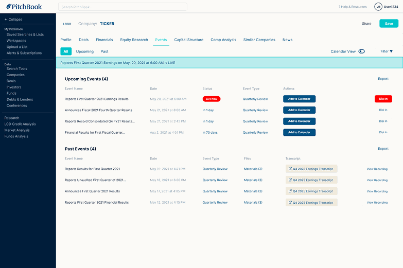
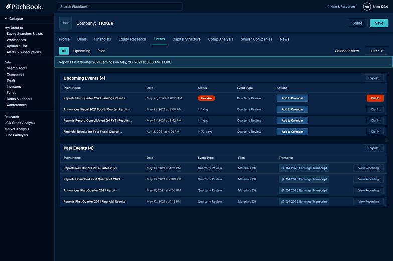
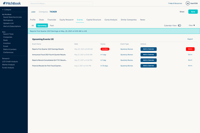
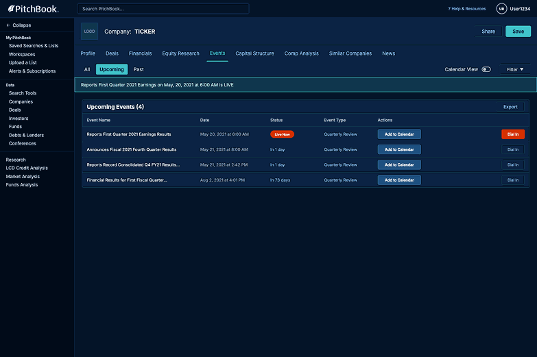
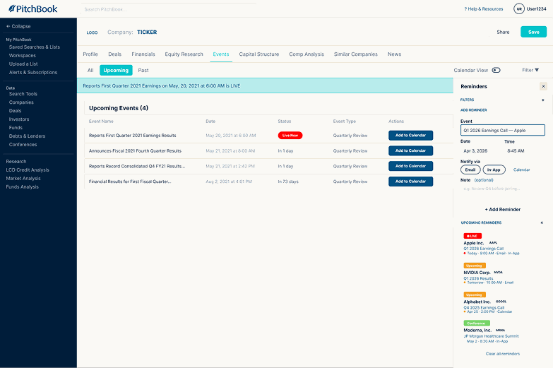
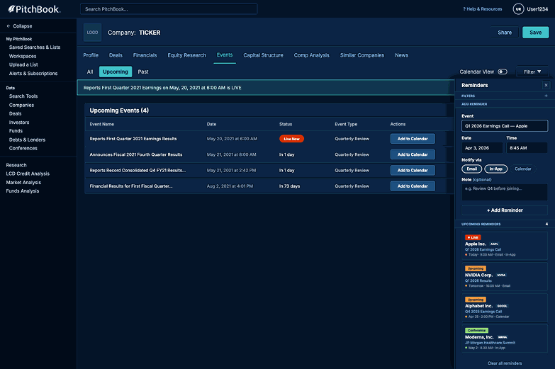
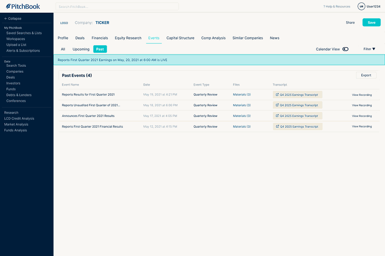
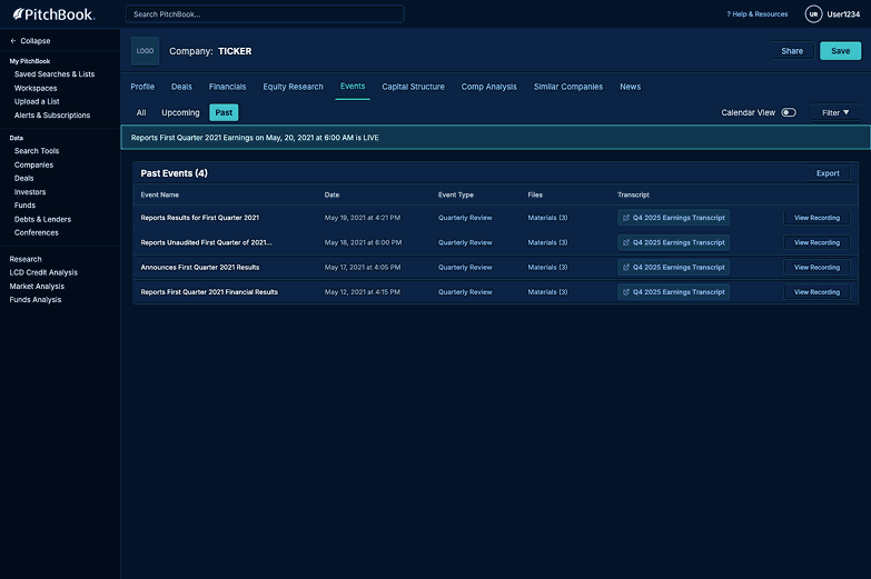
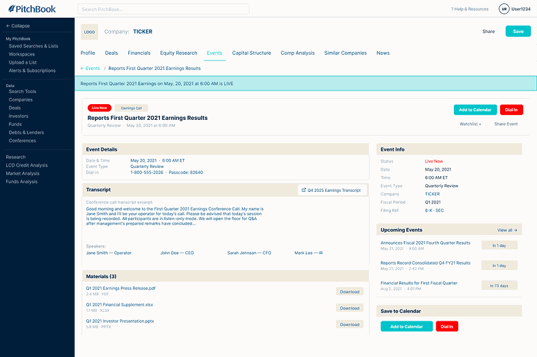
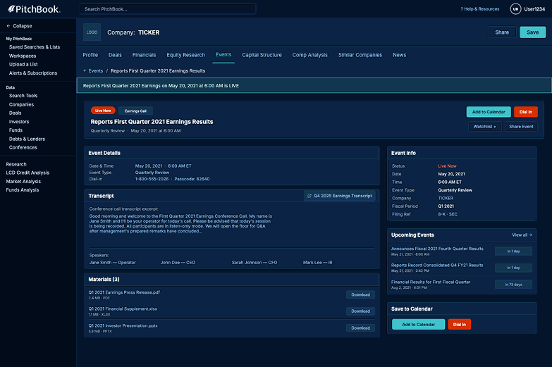
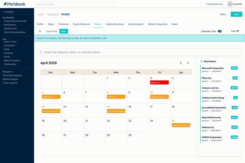
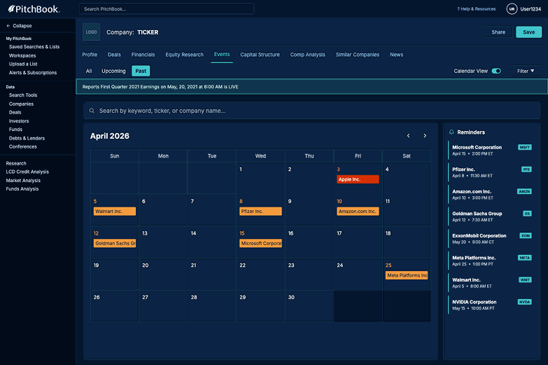
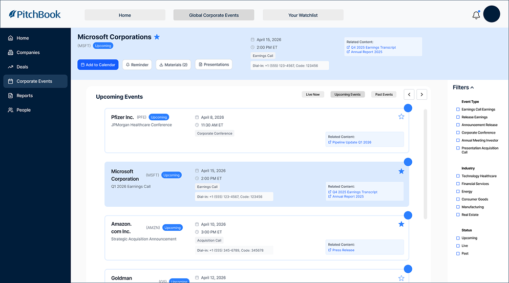
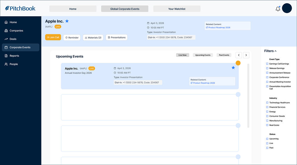
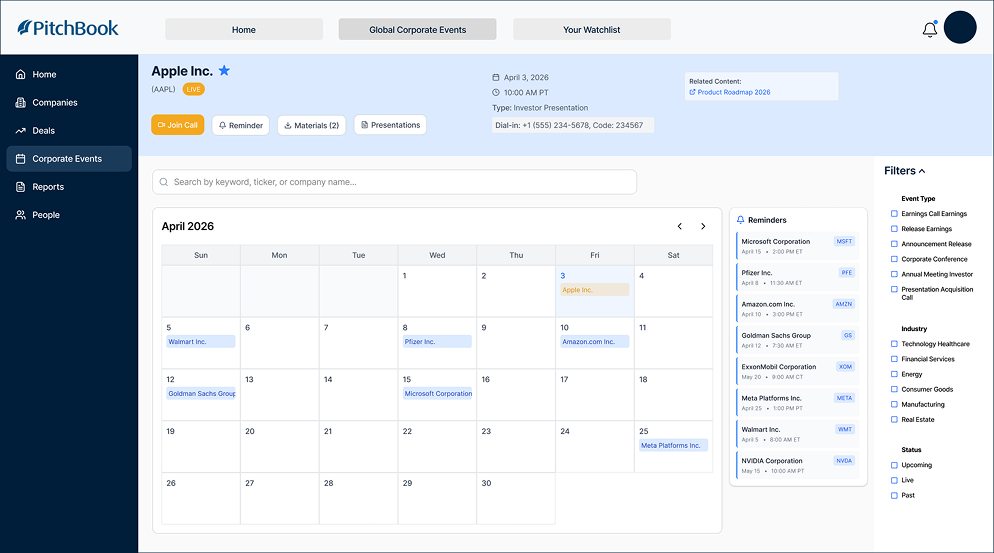
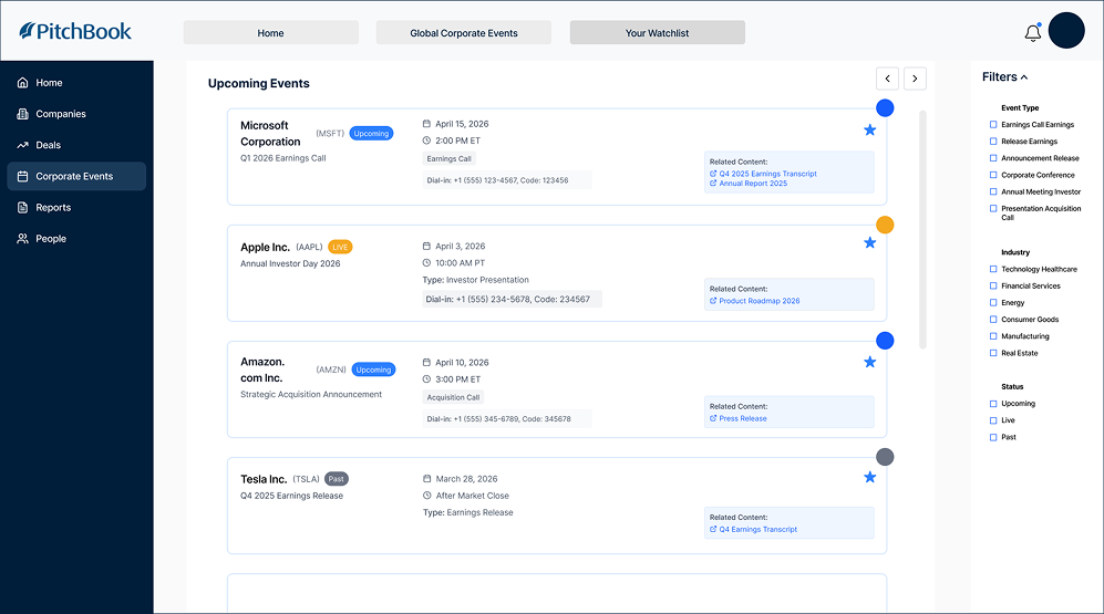
The final design gives PitchBook users one home for corporate events: a redesigned events tab with all / upcoming / past filtering, a calendar toggle, a docked reminders panel, and a full event-detail view (plus small touches like an unmissable "live now" badge and named, one-click document downloads).
How We Did It
Research
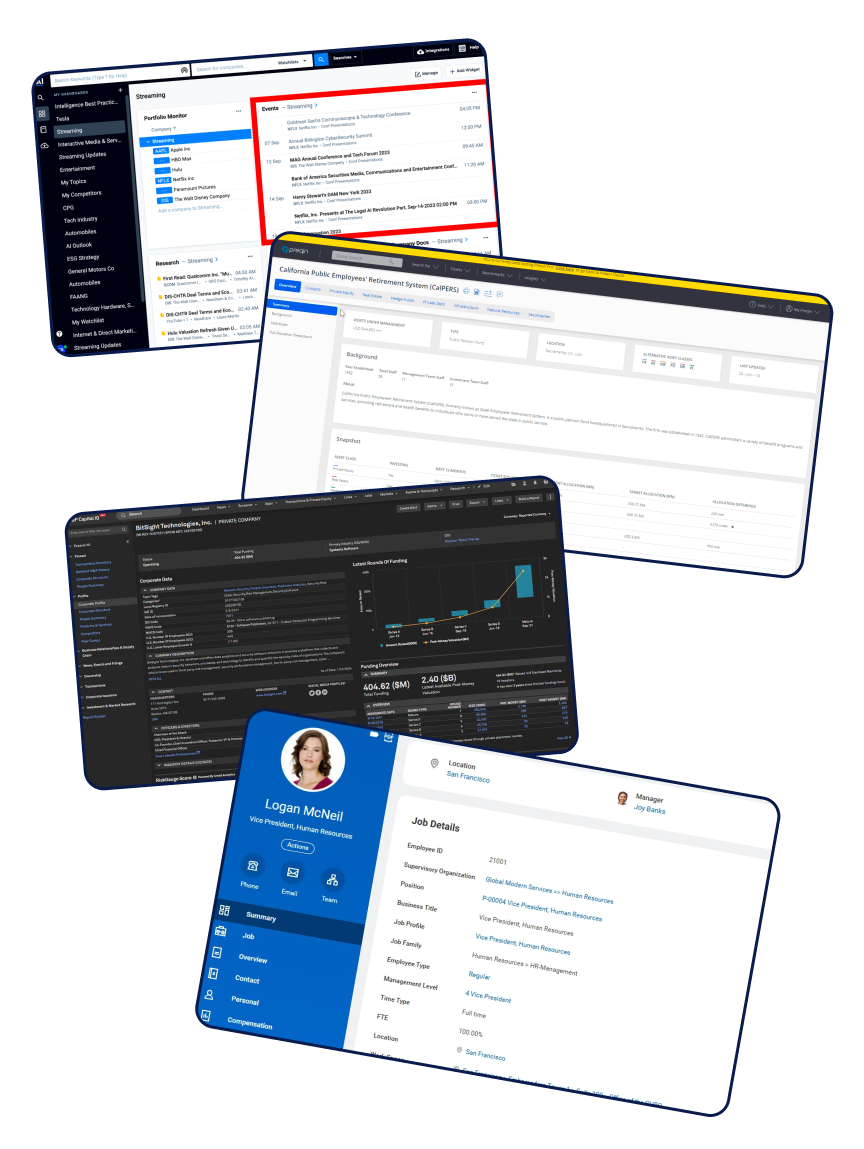
- 1 AlphaSense
- 2 S&P Capital IQ
- 3 Preqin
- 4 Workday
We audited four platforms that handle corporate events or financial data. AlphaSense, Preqin, and S&P Capital IQ were direct competitors; Workday, an indirect one, gave us an outside view on enterprise information design.
- AlphaSense — a clean dashboard with calendar integration, though live vs. upcoming status got buried in a document-centric view.
- Preqin — leaned on visual contrast to signal event status, pointing us toward our own "live now" treatment.
- S&P Capital IQ — sophisticated filtering, living in both a company profile and a dedicated events hub — a pattern we borrowed directly.
- Workday — an indirect reference whose profile-integrated events and calendar precedent shaped how we displayed dates.
Those audits pointed to three concrete opportunities: a dedicated event hub with real filtering; contrast and depth so a live event reads instantly; and corporate events living in two places, a company's profile and one global hub.
Design Opportunities
Three actionable opportunities extracted directly from the competitive audit.
Clean event dashboard with easier navigation & filtering
Create a dedicated event hub with advanced filtering by date, type, company, and sector. Reduce cognitive load by surfacing only the most relevant upcoming events for the user's portfolio.
Use visual contrast to surface live events instantly
Apply hierarchy techniques, contrast and depth, so users immediately identify a live event vs. upcoming vs. past without scanning the entire list.
Let Corporate Events live in two places
Events should appear within the Company Profile (contextual) and in a global Events hub (aggregated across the user's full portfolio). This mirrors how power users actually work.
To ground the work in real workflows, we built two personas from that research:
Alex Chen
Credit analyst, bulge-bracket bank
Alex covers 15 tech companies and attends every earnings call. He needs to efficiently compare event data, download materials, and set reminders across multiple events at once.
- Prep quickly before each earnings call
- Download transcripts & slides fast
- Set reminders for multiple events at once
- No side-by-side event comparison
- Downloads aren't prominently surfaced
- Reminders only work one at a time
Lisa Rock
Investment manager, mid-size hedge fund
Lisa manages a portfolio of 40+ public equities and relies on earnings events to time buy/sell decisions. She needs real-time updates and fast post-call transcript access.
- Track all portfolio events in one view
- Never miss a live call
- Access transcripts instantly post-event
- No aggregated portfolio events view
- Live status isn't obvious
- Transcript access is buried
The Major Pain Points
Iteration
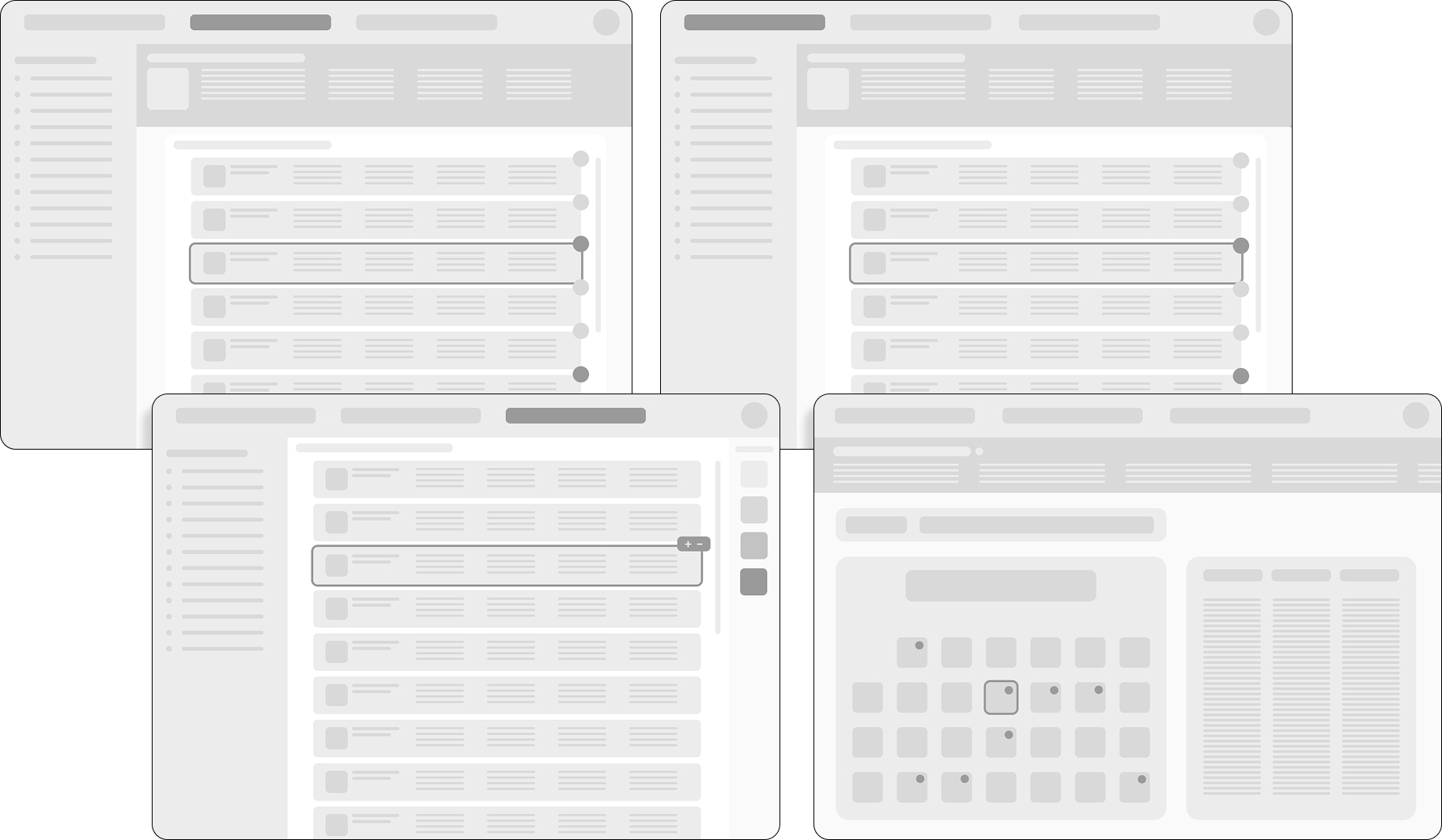
We started low-fidelity, sketching where corporate events should even live (a new tab? the company profile? both, it turned out) and how someone would move between an all-events view, a single company's events, and their own reminders. Our mentor pushed us early to agree on one shared system, colors, buttons, type, before going further, which saved us from a messier merge later.
From there we pushed toward high-fidelity, exploring a dedicated "Global Corporate Events" destination with its own top-level nav, color-coded status pills, and full light/dark support. One mistake that popped up at this point was not taking into consideration that PitchBook's branding wasn't a suggestion, it was a requirement — the rest of the product lived entirely inside the existing company-profile layout, so a standalone destination, however polished, didn't actually fit. That sent us back to rebuild the same screens as a tab inside PitchBook's own layout instead of a separate page.
Reflection
-
01
Build a shared system early. We all had four separate versions, which were hard to merge. Agreeing on one design system from day one would have saved real time.
-
02
Respect brand rules from the start. PitchBook's branding wasn't a suggestion, it was a requirement. Learning that early would have meant less rework later.
-
03
Collaborate, don't work in solos. Designing in isolation led to clashing styles; working in one file pushed us toward a single unified solution.
-
04
Stay curious and ask questions. Asking "why" and "how does this fit the brand" early kept small decisions from becoming last-minute problems.