Legibility Within Creativity
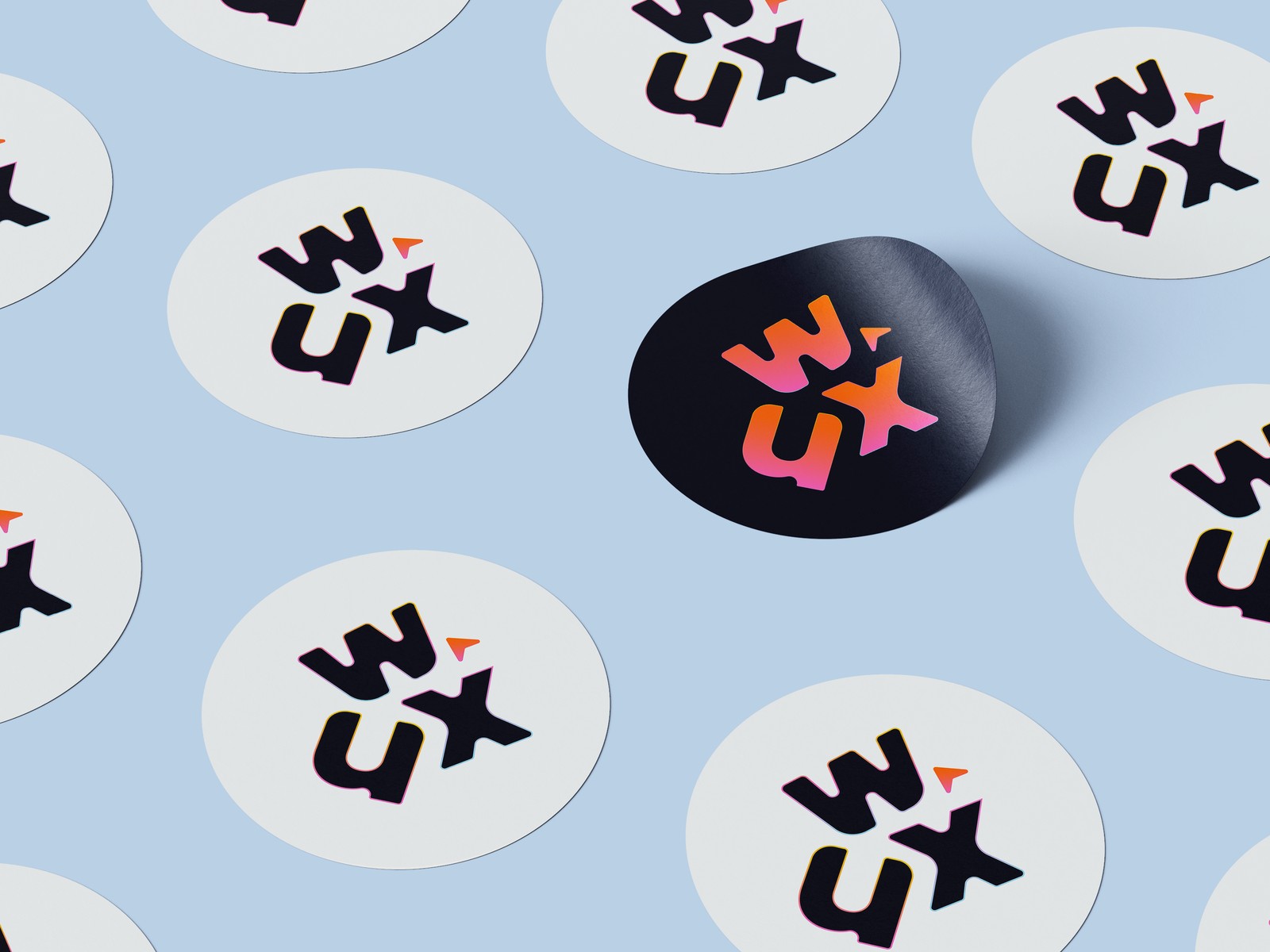
A new logo and brand system created for WashUX, our student-led UI/UX design club, to give the club a new image that feels as professional and intentional as our members' works.
The Rebrand
WashUX needed a mark that could hold its own next to every other club logo on campus, while still reading instantly as us: a merge of WashU and UX into one wordmark. The final logo interlocks a bold, hand-inked "W" and "X" around a small "U," with a cursor icon standing in for the club's whole mission: gathering students that are passionate about human-centered design. It ships in two color ways, a bright gradient version for dark surfaces and a solid navy version for light one, so it holds up on everything from a dark t-shirt to a white sticker.
-

Dark Mode -

Light Mode
The Design System
We built the palette around a professional blue that still left room for fun, so the club would read as technological, yet creative when layered with warmer accent colors. The logo would then be able to stand apart from every other campus logo built on the same navy. Blues carry structure and credibility, while the orange, yellow, pink, and magenta accents carry the energy and playfulness we wanted a student design club to have.
The Color Palette
Typographic Hierarchy
Type stayed just as simple as the color system: Poppins end to end, in four weights, so every touchpoint from a slide deck to a sticker sheet pulls from the same handful of sizes instead of reinventing itself each time. Below is the scale we settled on, each row set in its actual weight and size.
The Process
Once we knew we were designing a wordmark, I immediately went to my sketchbook instead of working digitally for intial iterations. This way, I knew I could stay loose, and be more intentional about what shape I wanted to create in an effcient manner.
Starting on Paper
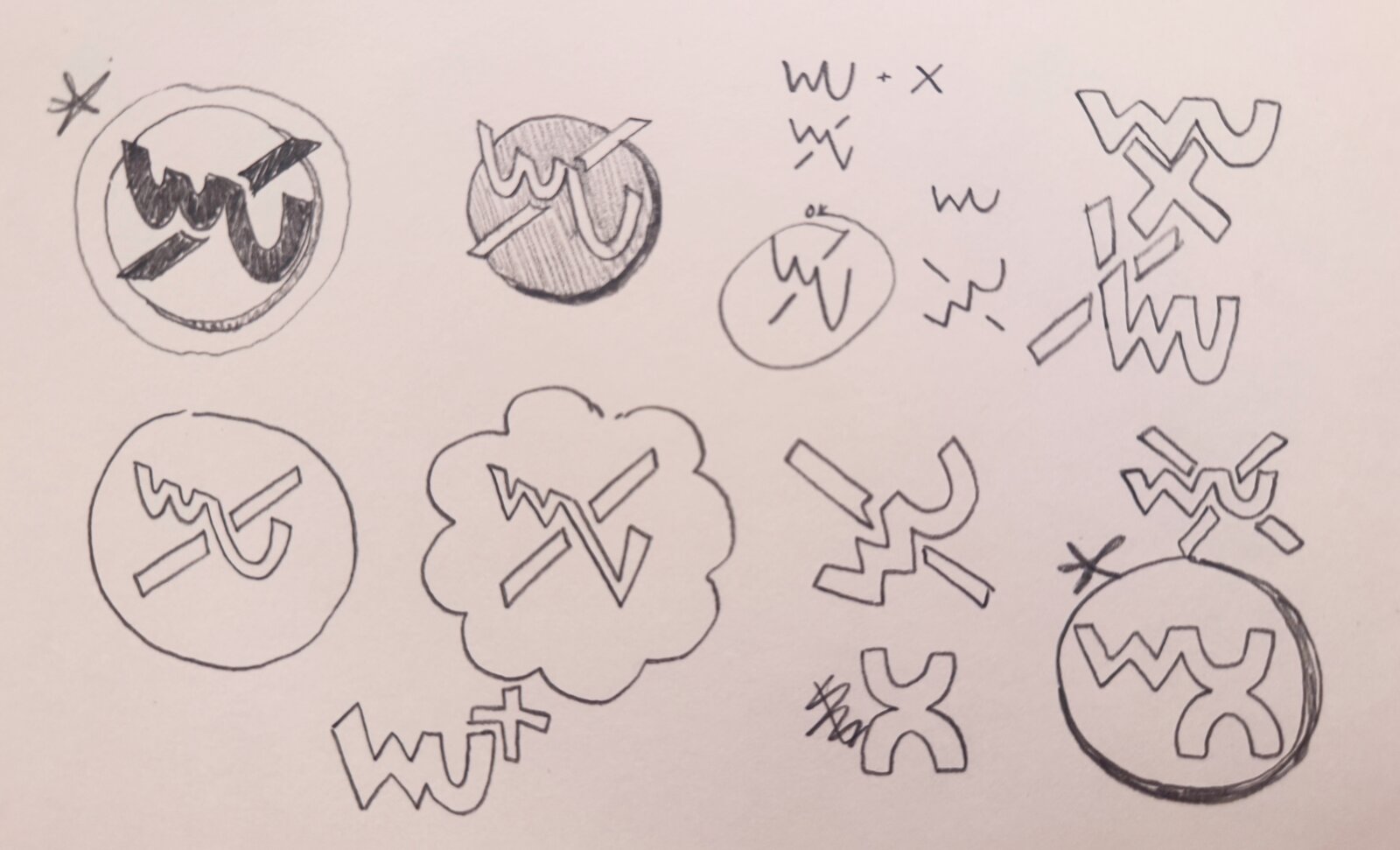
I started by drawing the intersection of "WU" and "X" together in every way I could think of: crossed out, circled, boxed in thought bubbles, or overlapping them. Most got scrapped fast, but they settled the big question early: the mark would read as a wordmark, not an icon, and that we wanted the letters to be the star of the show.
Next direction: Intersection
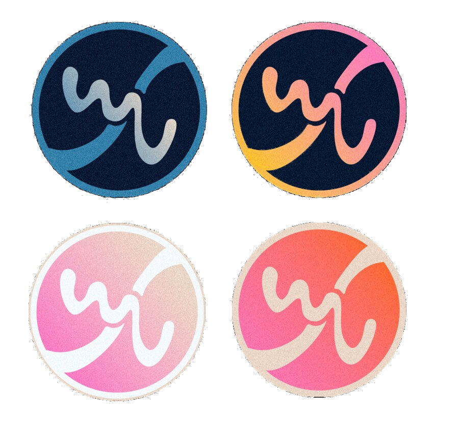
This direction was leading me towards the right direction because it was created with simple shapes, yet they still read as letters: one line, drawn in a single stroke created the "X" that intersected the university's letters. But when showing the other club members, everybody initially read "WU" instead of "WUX". A logo that needs a caption to be understood wasn't going to work for a club trying to build name recognition, so we shelved it in favor of the bolder, letterform-driven direction below.
Iterate, Iterate, Iterate!
Once we established that directly using the letters themselves was the way to go, the real iteration happened. Once we committed to keeping the letters legible, I ran two full rounds on the bold wordmark, fourteen separate badges in total, each one iterating on the outline, weight, color pairing, or angle a little further before we landed on a version worth shipping.
Round One: Locking in the Letterforms
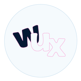

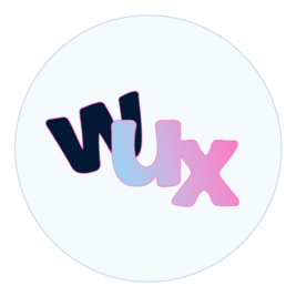

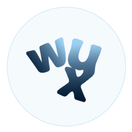

This first round is where the letterforms actually got fixed: how far the "U" tucks under the "W," how sharply the "X" kicks out to the right, and how thick the outline needed to be to stay legible at favicon size. We also tested a monochrome outline-only version as a stamp/watermark variant for merch, which made it into the final system as a secondary mark.
Round Two: Locking in the Shape








Once we'd committed to keeping the letters legible, the rounds moved fast: outline versus filled, single color versus gradient, and eventually the little cursor mark next to the "W", since it felt like we were missing something.
Reflection
-
01
Iterating is a catalyst for creativity. Fourteen badges felt like overkill when we started counting, but almost none of the ideas that ended up mattering, showed up in round one. They surfaced because we kept forcing ourselves to make one more version, not because we sat and willed them into existence.
-
02
Stay focused on portraying a UI/UX image rather than trying to approach too creatively. It would have been easy to let a student club logo get too playful and lose credibility, or overcorrect into something so buttoned-up it stopped feeling like a design club at all. Every round we cut down to the pairing that struck that balance.
-
03
A simple takeaway but an important one: Making logos is fun! Somewhere between the fifth and tenth badge, this stopped feeling like a deliverable and started feeling like play. That energy is worth protecting on future projects, not just tolerating.